The Role of Typography in Branding: Creating Memorable Visual Identities
In the realm of branding, typography is more than just a visual element — it’s a powerful tool that can convey a brand’s personality, values, and message at a glance. Typography shapes the way we perceive a brand and can significantly impact its recognition and memorability. As competition intensifies in 2024, the strategic use of typography in branding is essential for creating a cohesive and compelling visual identity.
The Basics of Typography
Understanding the basics of typography is crucial for any designer looking to harness its power effectively. Here are the key components:
1. Typefaces and Fonts
- Typefaces: A typeface is a family of fonts that share common design features. Examples include Arial, Times New Roman, and Helvetica.
- Fonts: A font is a specific style within a typeface family, such as Arial Bold or Times New Roman Italic.
2. Serif vs. Sans-Serif
- Serif: These typefaces have small lines or strokes attached to the ends of letters (e.g., Times New Roman). They are often seen as traditional and reliable.
- Sans-Serif: These typefaces lack the small lines at the ends of letters (e.g., Helvetica). They are viewed as modern and clean.
3. Kerning, Leading, and Tracking
- Kerning: The adjustment of space between individual letter pairs to achieve visual balance.
- Leading: The vertical spacing between lines of text, impacting readability.
- Tracking: The uniform spacing between characters across a block of text.
How Typography Influences Brand Perception
Typography is a subtle yet powerful way to influence how a brand is perceived. Here’s how different elements of typography can shape brand identity:
1. Conveying Brand Personality
- Playful and Fun: Brands targeting a younger audience or aiming for a casual tone might use rounded, whimsical typefaces.
- Elegant and Sophisticated: Luxury brands often use classic serif typefaces with high contrast.
- Modern and Innovative: Tech companies may opt for sleek sans-serif typefaces to convey forward-thinking and innovation.
2. Enhancing Readability and Accessibility
- Readability: Clear and legible typefaces ensure that the brand’s message is easily understood.
- Accessibility: Considering factors like font size, contrast, and spacing helps make content accessible to a wider audience, including those with visual impairments.
3. Creating Emotional Connections
The right typography can evoke emotions and build connections with the audience. For example, a handwritten typeface can create a personal and approachable feel, while a bold, geometric typeface can evoke strength and stability.
Case Studies: Iconic Brands and Their Typography
Examining the typography choices of iconic brands can provide valuable insights into effective branding. Here are a few examples:
1. Coca-Cola
Coca-Cola’s script typeface is instantly recognizable and evokes nostalgia and tradition. The flowing, cursive letters reflect the brand’s long history and friendly, approachable nature.
2. Apple

Apple uses a clean, minimalist sans-serif typeface (San Francisco) across its branding. This choice reinforces the brand’s emphasis on simplicity, innovation, and modern design.
3. Nike

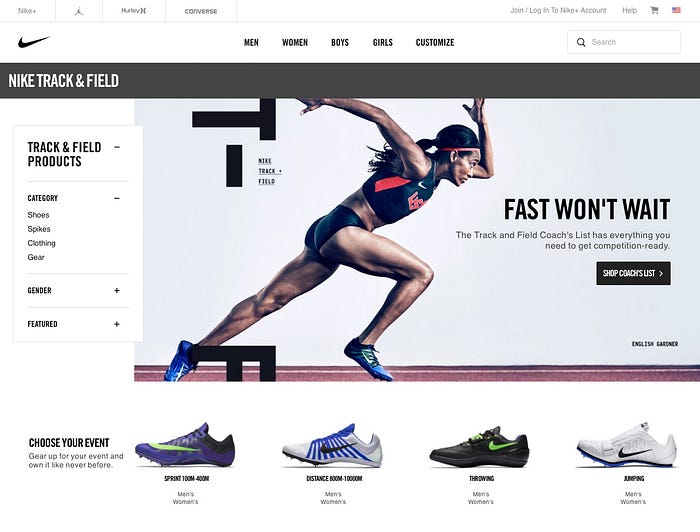
Nike’s use of the bold, italicized typeface in its logo conveys movement and dynamism, aligning perfectly with its brand message of athleticism and performance.
Tips for Choosing Typefaces for Branding
Selecting the right typefaces for a brand involves a careful balance of aesthetics and functionality. Here are some tips to guide the process:
1. Understand the Brand’s Personality
Start by clearly defining the brand’s personality and values. Choose typefaces that reflect these attributes and resonate with the target audience.
2. Prioritize Legibility
Ensure that the chosen typefaces are legible across different mediums and sizes. Test how they look in various contexts, from print to digital screens.
3. Create a Hierarchy
Establish a typographic hierarchy to guide the viewer’s eye through different levels of information. Use different weights, sizes, and styles to distinguish between headings, subheadings, and body text.
4. Consider Versatility
Choose typefaces that offer versatility and flexibility. They should work well in various formats and allow for cohesive application across all brand materials.
5. Avoid Overuse of Fonts
Limit the number of typefaces to maintain a cohesive and uncluttered look. A good rule of thumb is to use no more than three different typefaces within a brand.
Conclusion: Typography as a Key Element in Visual Identity
Typography is a fundamental component of branding that goes beyond mere aesthetics. It plays a crucial role in conveying a brand’s personality, enhancing readability, and creating emotional connections with the audience. As we move further into 2024, the strategic use of typography will continue to be a key element in crafting memorable and effective visual identities. By understanding the basics of typography, recognizing its impact on brand perception, and choosing typefaces thoughtfully, designers can elevate their branding efforts and ensure their work stands out in a competitive landscape.
Like what you see? Follow us on Instagram, Threads, and TikTok. If you’re a brand, you can collab with us through Passionfroot. If you want to support our work, buy us a coffee.
